
Gold Price Chart — Live Gold Chart, Price Graph & History
-
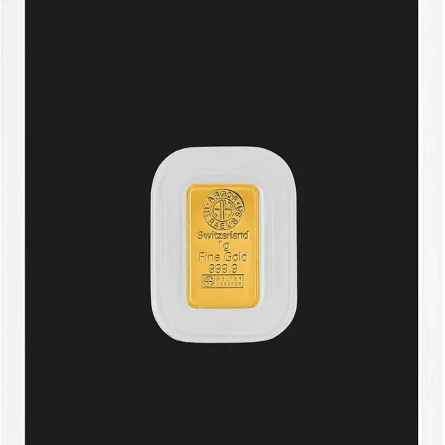
- Fine gold999.9
- Weight1 gram
- ProducerArgor-Heraeus
-
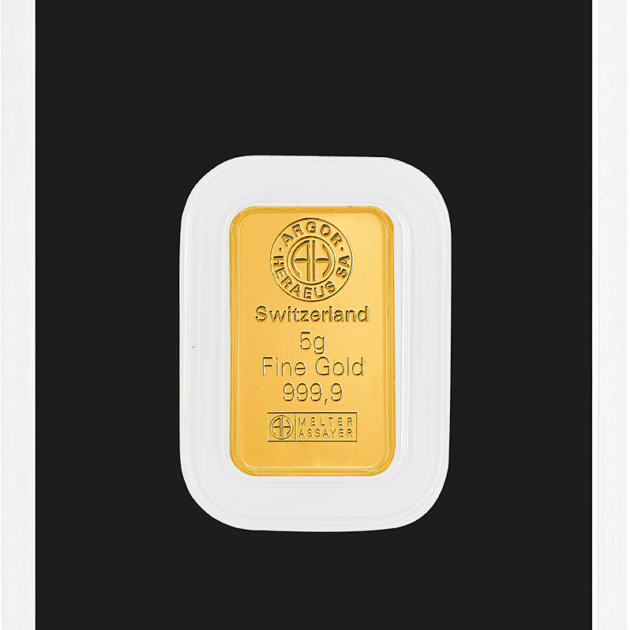
- Fine gold999.9
- Weight5 grams
- ProducerArgor-Heraeus
-
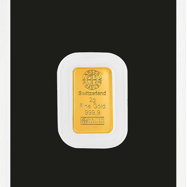
- Fine gold999.9
- Weight2 grams
- ProducerArgor-Heraeus
-
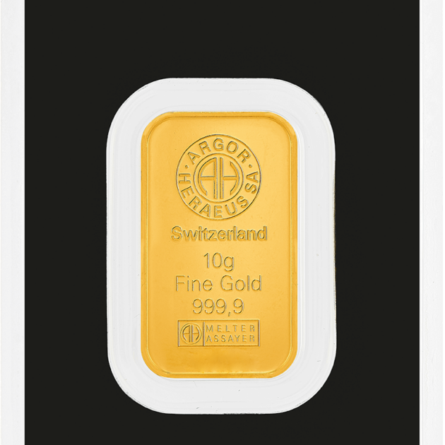
- Fine gold999.9
- Weight10 grams
- ProducerArgor-Heraeus
-
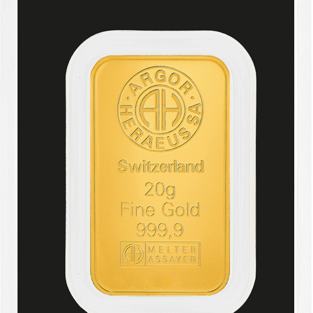
- Fine gold999.9
- Weight20 grams
- ProducerArgor-Heraeus
Understanding the gold market starts with one simple thing — seeing the price move in real time. A modern gold price chart gives you exactly that: a live view of how gold behaves right now, without delays or outdated data.
On this page, the gold chart is displayed in euros, making it directly relevant for users in Bulgaria, while still reflecting the global benchmark in US dollars. Since gold is traded internationally in USD, every movement you see in EUR is influenced by both the global price and the EUR/USD exchange rate.
What makes this especially useful is the context behind it. The gold price graph combines live data with historical movement, allowing you to zoom out and understand how the market evolves over time. One point shows the present, but the full chart shows the pattern.
For investors, this becomes a working tool rather than just a reference. Instead of reacting to headlines, you can follow trends, compare movements, and see how gold responds to different market conditions in a clear and structured way.
Current Gold Price Chart – How to Read the Quotes?
At first glance, a gold price chart may look like a simple line, but every part of it carries meaning. The price displayed is the spot price — the current market value of gold traded globally in real time.
Gold is measured using different units. The most important is the troy ounce (31.1 grams), which serves as the global standard. At the same time, many versions of a chart also show prices per gram or kilogram, making it easier to interpret depending on your needs.
Another key factor is the difference between EUR and USD pricing. The international benchmark is reflected through the gold USD chart, while the EUR value adjusts based on the exchange rate. This means the same gold can appear to move differently depending on the currency you are viewing.
To read the chart correctly, it helps to break it down into simple elements:
- the horizontal axis shows time — from minutes to years
- the vertical axis shows the price level
- upward movement indicates price growth
- downward movement shows a decline
- longer timeframes reveal trends, while short ones show volatility
Once these basics are clear, the chart becomes much easier to understand. Instead of random movement, you start seeing structure, direction, and patterns that reflect real market behavior.
Gold Chart Live — Real-Time Data
A gold chart live reflects the market as it happens. Prices are updated continuously, based on trading activity across global exchanges where gold is actively bought and sold.
These short-term movements are driven by multiple factors — market sentiment, economic data, currency fluctuations, and global events. Because of this, the price can change within seconds, even if the overall trend remains stable.
For users in Bulgaria, viewing gold in euros provides a more practical perspective. While global markets operate in USD, the local chart translates that price into EUR, making it easier to understand the real value in your own currency.
In practice, a live chart becomes a decision-support tool. It allows you to observe how the price reacts in real time, follow momentum, and better understand timing. Instead of guessing what the market is doing, you are watching it unfold — and that gives a clear advantage in reading price behavior.
Gold Price History – Key Milestones
Looking at the gold price history helps put current movements into perspective. Short-term fluctuations may seem significant, but over time, gold follows broader economic cycles shaped by crises, inflation, and monetary policy.
The modern gold market has gone through several key phases. Each of them reflects how investors react when uncertainty increases and traditional financial systems come under pressure.
To understand the bigger picture, it is enough to focus on the main milestones:
- 2008 financial crisis — sharp increase in demand as investors moved into safe-haven assets
- 2011 peak — gold reached a historical high following prolonged economic instability
- 2020 COVID period — new highs driven by global uncertainty and aggressive monetary stimulus
- 2024–2025 growth phase — continued rise supported by inflation, geopolitical risks, and central bank demand
Despite periods of correction, the long-term direction remains clear. Gold tends to move in cycles, but over extended periods, the trend has historically been upward, especially during times of economic stress.
Gold Price in EUR – Live Chart for Bulgaria
Gold is traded globally in US dollars, but for practical use, the price is often converted into local currencies. For users in Bulgaria, this means following the price of gold in euros rather than relying only on USD-based data.
The difference between USD and EUR pricing comes from the EUR/USD exchange rate. Even if the global gold price remains stable, changes in the currency can shift the local value. This is why the same movement may look different depending on which chart you are viewing.
A live gold chart in EUR reflects the actual cost for a local investor. While the USD chart shows the global benchmark, the EUR version translates that movement into real purchasing terms. This makes it far more relevant for decision-making.
Platforms like DealFin provide EUR-based charts that combine global market data with currency conversion. As a result, you see not just where gold is trading globally, but what that price actually means in your local context.
Track the gold price chart in real time on DealFin.bg and follow how the market moves in EUR. The platform provides a live chart with both current data and historical trends for better context.
DealFin is a reliable source for monitoring the price and understanding market dynamics.
FAQ – Gold Price Charts
